The Matplotlib and Seaborn for Data Visualization course is designed to introduce you to the essential Python libraries for data visualization: Matplotlib and Seaborn.
Matplotlib and Seaborn for Data Visualization
The Matplotlib and Seaborn for Data Visualization course is designed to introduce you to the essential Python libraries for data visualization: Matplotlib and Seaborn. Matplotlib is the foundational plotting library in Python, providing tools to create a wide variety of static, animated, and interactive plots. Seaborn is built on top of Matplotlib, offering a higher-level interface for drawing attractive and informative statistical graphics.
This course will guide you through the process of creating a variety of plots, customizing them, and understanding how to represent your data effectively. Whether you are visualizing simple datasets or working with more complex datasets, you'll gain the practical skills to turn your data into insightful visualizations that help with decision-making and analysis.
This course is perfect for anyone interested in learning how to visualize data in Python using Matplotlib and Seaborn. Data scientists, analysts, researchers, and software developers who want to enhance their data visualization skills will find this course valuable. It's also an excellent choice for students or professionals looking to improve their data analysis and presentation abilities. Prior knowledge of Python programming is recommended, but no previous experience with Matplotlib or Seaborn is required. If you're looking to dive into data visualization or improve your existing skills, this course will provide you with the knowledge to build professional and impactful visualizations.
Understand the fundamentals of Matplotlib and Seaborn for effective data visualization.
Create basic plots using Matplotlib, including line plots, bar charts, and histograms.
Apply advanced plotting techniques in Matplotlib to customize and style visualizations.
Explore Seaborn's built-in statistical plots for better understanding of your data.
Visualize complex datasets using Seaborn for statistical insights.
Customize and style visualizations to create aesthetically appealing and informative plots.
Learn best practices for data visualization to enhance the interpretability of your plots.
Create interactive and informative visualizations for real-world datasets.
-
Learn the importance of data visualization, an overview of Matplotlib and Seaborn, and how they fit into the data science workflow. Understand the basics of installing and setting up these libraries.
-
Explore how to use Matplotlib's plt module to create fundamental plots such as line charts, scatter plots, and histograms. Understand the basic structure of a Matplotlib plot.
-
Dive deeper into Matplotlib by learning advanced plotting techniques, including customizing axes, adding annotations, and using subplots. Learn how to plot complex data structures and improve your visualizations.
-
Get familiar with Seaborn and its advanced features. Understand how Seaborn builds on Matplotlib to simplify the creation of more sophisticated plots, such as heatmaps, box plots, and violin plots.
-
Learn how to create statistical plots using Seaborn, such as regression plots, pair plots, and distribution plots. Gain insights into how Seaborn helps with understanding statistical relationships in data.
-
Explore how to customize the look and feel of your plots. Learn how to adjust colors, labels, legends, and themes to create polished and professional visualizations that are easy to interpret.
-
Learn how to work with more complex datasets and use Seaborn to create multi-variable visualizations, including facet grids and categorical plots.
-
Wrap up the course by reviewing the best practices for effective data visualization. Complete a final project that demonstrates your ability to create meaningful visualizations using real-world data.
Earn a Professional Certificate
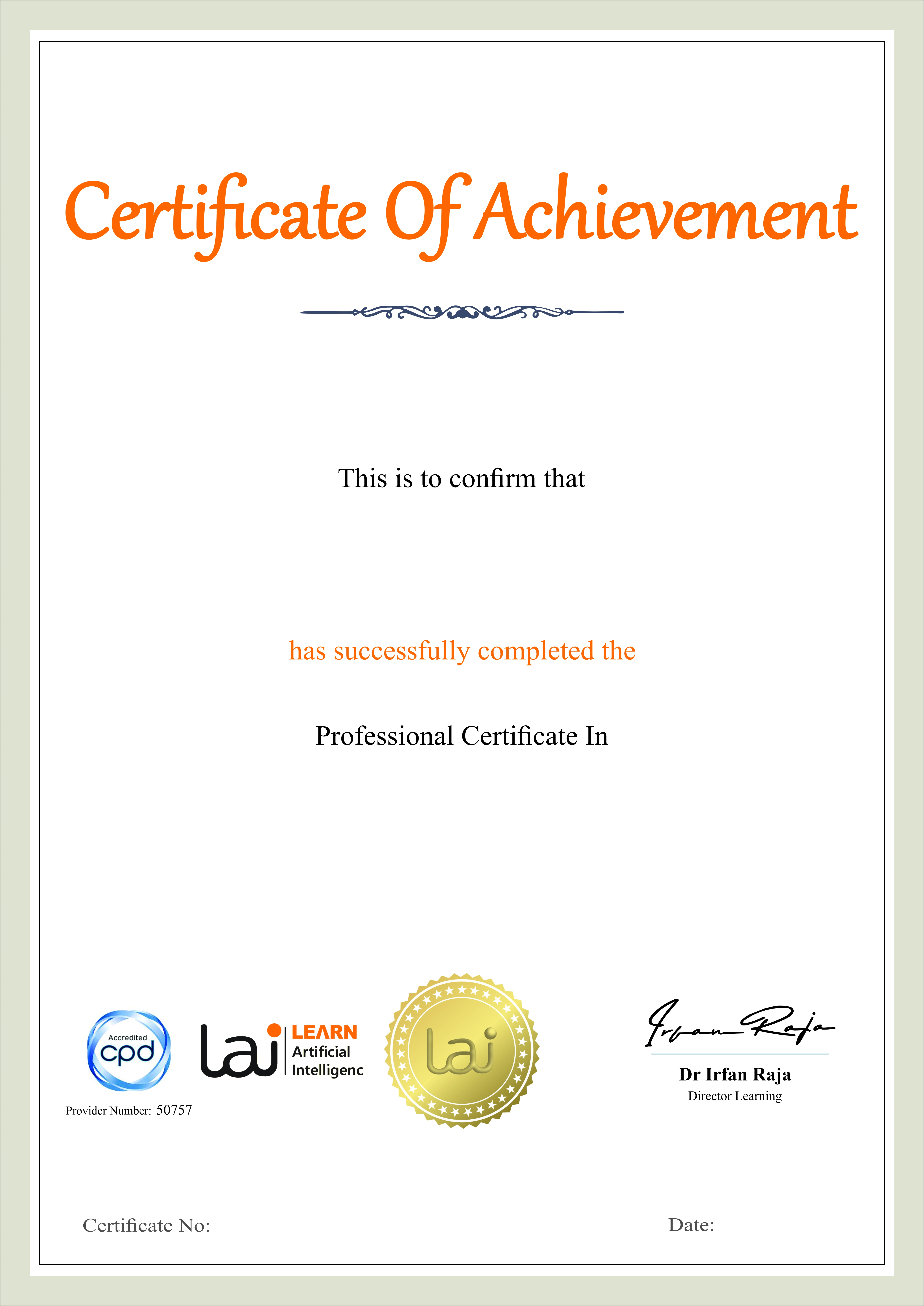
Earn a certificate of completion issued by Learn Artificial Intelligence (LAI), accredited by the CPD Standards Office and recognised for supporting personal and professional development.

Key Aspects of Course

CPD Accredited
Earn CPD points to enhance your profile

Free Course
This course is free to study

Self-Paced
No time limits or deadlines

Flexible & 24/7 Access
Learn anytime , anywhere

Build in demand job skills
Get job ready

Updated AI Skills
Stay current with AI advancement

Global Learning
Accessible Worldwide

Premium Materials
High-quality resources

Employer Approved
Boost your career prospects


